

Dear Leader, Black Is Not Your Power Colour, And That’s Actually Good News
A truth for business and public leaders who are ready to stop hiding and start commanding
Let’s talk about the elephant in the boardroom.
You walked in wearing black. Again. You told yourself it was “classic.” “Professional.” “Powerful.” And honestly? It looked fine. But fine is not the same as memorable. Fine is not the same as commanding. And fine is certainly not the same as you.
Here is the uncomfortable truth that the image management industry has known for decades but rarely says loudly enough:
Black is not a universal power colour. It is a default. And defaults are for people who haven’t yet decided who they are.
The image management and personal branding world has long understood that colour is not decoration; it is communication.
The Colour Association of the United States (CAUS), one of the oldest colour forecasting bodies in the world, has consistently noted in its research that colour affects perception of authority, approachability, and trustworthiness and that the wrong colour on the wrong person creates what industry professionals call “visual noise” a disconnect between what you are saying and what your appearance is communicating.
Donna Fujii, pioneering image consultant and author of Colour with Style, established that wearing colours outside your natural seasonal palette, regardless of how “powerful” those colours are culturally, creates what she termed “colour interference”: a subtle but real distraction that pulls an audience’s attention away from your message and toward your appearance for the wrong reasons.
The Association of Image Consultants International (AICI), the global professional body for image consulting, trains its certified practitioners in the principle that power dressing is not about wearing what is culturally associated with authority. It is about wearing what creates congruence alignment between your natural colouring, your personality, your role, and your intention. When those four things align, that is when a leader walks into a room, and the room adjusts.
And black? Black absorbs light. For some people, especially those with a strong contrast between their skin and hair, it can look striking and powerful. But on others, it can quite literally drain colour from the face. In the industry, we call this “the corpse look”: the skin appears pale or washed out, loses its natural glow, and starts to look dull or lifeless. The result is a flattening of facial features and a reduction in the very presence a leader is trying to project.
In other words, black can make you disappear. And you cannot lead from the invisible.
Now, let us bring this home, because for leaders operating in African business and public life, there is an additional layer that makes this conversation even more urgent.
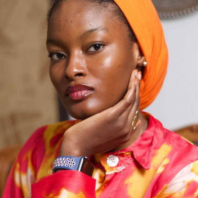
African skin tones carry extraordinary warmth, depth, and richness. Earth tones, jewel tones, warm neutrals, bold saturated colours, these do not just work on melanin-rich skin. They sing. They create what image professionals call “luminosity” a quality where the face appears lit from within, energised, alive.
When a leader with deep, warm skin tones walks into a room in rich burgundy, cobalt, forest green, burnt orange, or a beautifully tailored print, they do not just look good. They own the room. They signal cultural confidence. They signal that they know who they are.
That is a different kind of power than black.
Black says: I am a professional. The right colour says: I am here. I am fully here. And I am not asking for permission.
“But I Look Good in Black”, I know. I hear you. And you probably do. But here is the distinction your Leadership Presence Strategist wants you to understand:
Looking good and looking powerful are not the same thing.
Looking powerful and looking memorable are not the same thing, either.
Looking memorable and looking like yourself is the target. That is the intersection where your personal brand lives.
The leaders who become iconic, the ones people quote, reference, follow, and remember long after the meeting ends, are rarely the ones who blended in. They are the ones who dared to show up in their full colour. Literally and figuratively.
So What Is Your Power Colour?
That depends on three things:
1. Your natural colouring: your skin tone, eye colour, and the undertones in your complexion. A professional colour analysis will identify whether you carry warm, cool, or neutral undertones, and this determines which colours create luminosity on you versus flatness.
2. Your brand intention: what do you need the room to feel when you enter? Trust? Energy? Authority? Warmth? Different colours communicate different things — and that communication happens before you open your mouth.
3. Your context: the culture, the audience, the occasion. Power dressing in Lagos is not the same as power dressing in Accra, London, or Nairobi. A sophisticated image strategy is context-intelligent.
The Invitation
The next time you reach for black because it is safe, pause.
Ask yourself: Am I dressing to lead or am I dressing to hide?
Because here is the thing about leadership that nobody puts in the MBA programme:
People follow energy. People follow presence. People follow aliveness. And aliveness has colour.
You were not called to blend in. You were called to stand out, speak up, and show up in the full, unapologetic truth of who you are.
Your power colour is waiting.
Want to discover your power colour and build an executive image that commands the room before you say a word? This is exactly the work we do. Let’s talk HERE
Related posts